These color ideas aren’t just pretty—each palette is tuned for rest, focus, and that “ahhh” moment when you walk in. Think fewer blues, more mood, and serious sleep vibes. FYI, calm spaces actually boost recharge time, so you’ll thank me later.
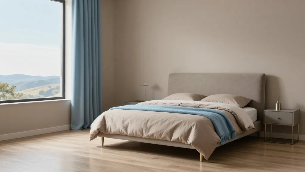
1. Sea Glass Serenity: Soft Blues Meet Whisper-White
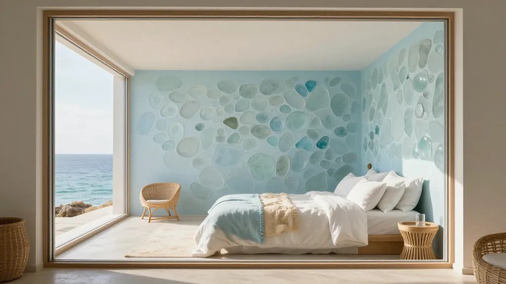
Sea glass tones create a tranquil, spa-like mood without feeling chilly. This palette works with natural light or moody lamps, keeping the room feeling airy and calm.
Why it works:
- Gentle blues paired with warm whites soften edges
- Lifts mood while preserving sleep-friendly ambience
- Pairs well with textures like linen and rattan
Tips to pull it off: choose a main wall in a pale blue, insert white or cream bedding, and add a few sandy accents. Trust me, it’s relaxing without feeling clinical.
2. Warm Sand and Sage: Earthy Calm for Restful Nights

Earthy greens and sandy neutrals bring nature indoors, which helps reduce anxiety and create a grounded, restful space. It’s like a mini forest retreat in your bedroom.
Why it works:
- Soft sage adds depth without shouting
- Warm sand tones keep the room feeling inviting
- Excellent backdrop for plants and natural textures
How to style: layer different neutrals with a pop of olive green in pillows or a throw. A wood nightstand or wicker basket finishes the look with personality.
3. Misty Gray with Lavender Accents: Subtle Sophistication

Greige (gray-beige) walls with lavender accents strike a balance between modern and cozy. It’s not clinical gray and not bubblegum lavender—it’s the Goldilocks of bedroom palettes.
Why it works:
- Neutral base lets art and textiles shine
- Lavender accents feel calming, not cheesy
- Very forgiving with lighting changes
Play it smart: keep large surfaces in soft gray, and reserve lavender for bedding, a rug, or a single statement piece like a luxe throw.
4. Moonlit Charcoal with Soft Melon Mullions: Drama That Soothes
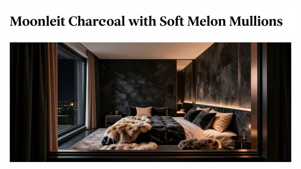
Dark walls can feel intimate and soothing when balanced with warm accents. A charcoal backdrop makes textures pop and helps nighttime routines feel luxurious.
Why it works:
- Prominent contrast creates cozy corners
- Warm textiles prevent the space from feeling cold
- Great for small rooms to feel bigger via reflected light
How to do it: keep ceilings lighter, add metallic accents, and layer velvet or faux fur for tactile warmth. Seriously, your bedtime playlist will upgrade itself.
5. Vanilla Cream with Oatmeal Undertones: Crisp Yet Comforting
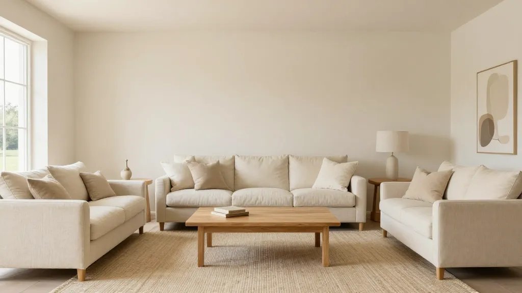
Creamy walls with subtle oat undertones read clean and inviting. It’s the “easy to live in” palette that still looks tailored and put-together.
Why it works:
- Brightens without harsh glare
- Matches almost any decor style
- Perfect canvas for colorful art or textiles
Style notes: emphasize with natural wood furniture, ivory linens, and a textured rug to avoid flatness. This is your blank canvas—paint on your personality later.
6. Sage-Tainted White: Fresh Air in a Small Space

A crisp white base with sage-tinted undertones feels breathable and fresh, almost like you opened a window to a spring morning.
Why it works:
- Keeps room feeling airy and bright
- Understated green hints feel luxe, not clinical
- Great for minimalists who still crave warmth
Implementation: use white as the dominant color, bring in sage through bedding, curtains, and a leafy plant or two for life.
7. Blush with Dusty Navy: Gentle Contrast That Calms the Brain
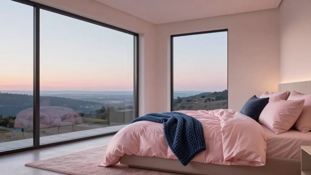
Blush pink softens the space while dusty navy provides a quiet anchor. This combo whispers coziness and a touch of sophistication.
Why it works:
- Balanced contrast keeps the room visually interesting
- Blush adds warmth; navy grounds without overpowering
- Perfect for a feminine-meets-masculine vibe
Tactile tip: mix satin sheets with a chunky knit throw to maximize tactile comfort without overpowering the palette.
8. Taupe and Sky: Neutral Backdrop with a Hint of Sky Color
Taupe walls with a soft blue accent create a calm, versatile space that pairs with any accent color. It feels timeless and serene, like a well-loved retreat.
Why it works:
- Versatile base for evolving decor
- Blue accents keep the room from feeling flat
- Easy to design around for years to come
How to use: keep large surfaces taupe, add a sky-blue throw or curtains, and incorporate metallic hardware for a modern polish.
These eight palettes prove you don’t need loud color to feel calm—just intention, texture, and a little playful contrast. FYI, calm spaces actually boost sleep quality and mental clarity, so you’re investing in yourself every night.
Want a quick recap? Pick a base tone, layer texture, and introduce a single accent color to keep things cohesive. Seriously, you’re only a few swaps away from a room that feels like a serene retreat.
Ready to turn one of these into your reality? Start with the bedding swap, then build with wall color or textiles. Your future calmer mornings are closer than you think.
Conclusion: You’ve got the framework—now go experiment. The right palette plus texture combos can transform your bedroom from meh to magical in a weekend. Let’s do this!

