
If you love calm, chic spaces that still feel totally current, you’re in the right place. These designer neutral palettes prove you can mix warmth, texture, and a whisper of color without ever tipping into boring. FYI, a great neutral is a chameleon in your home.
1. Soft Sand and Misty Linen Retreat
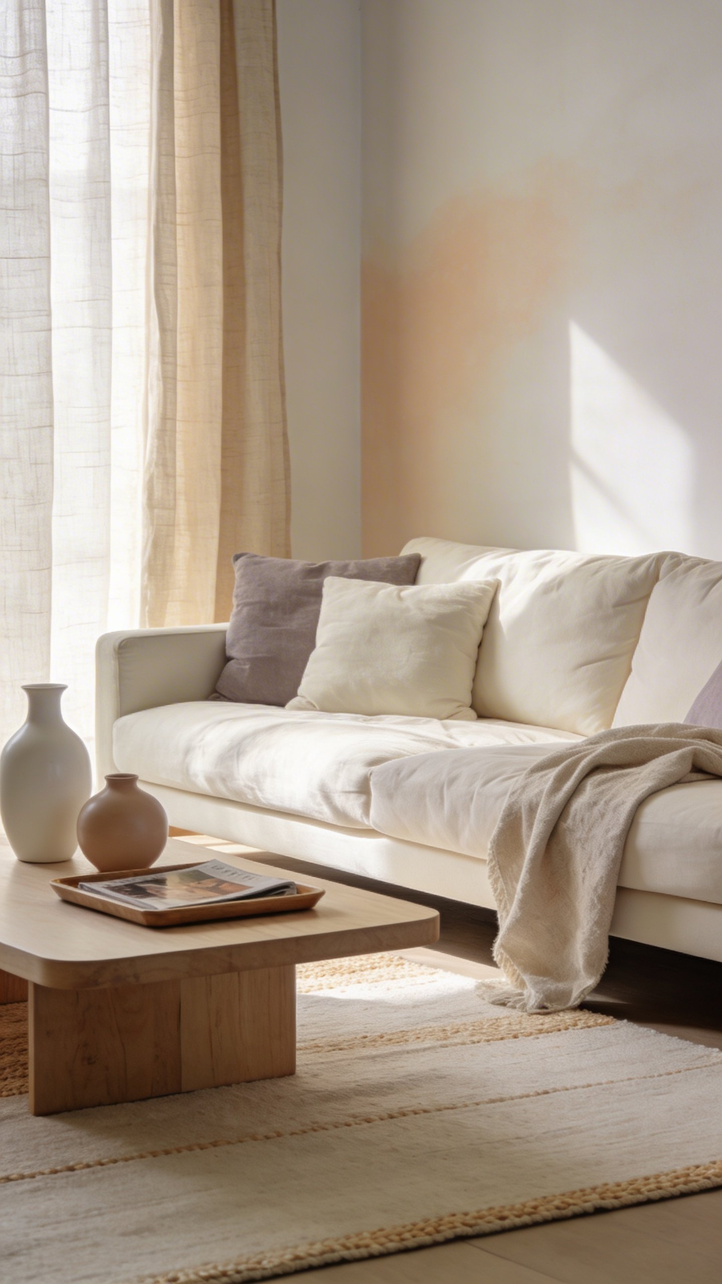
Imagine walking into a sunlit living room that whispers relaxation. This design embraces airy neutrals that feel cozy, not clinical.
The vibe leans serene and approachable, perfect for everyday living with a touch of spa-like calm. Seriously, you’ll want to curl up with a magazine and never leave.
Color Palette
- Walls: warm off-white with a hint of almond
- Accents: pale taupe, soft greige, and ivory
- Texture notes: oat, linen, and linen-weave textiles
Key Pieces
- Low-profile cream sofa with loose covers
- Rattan coffee table and light oak sideboard
- Textured wool and linen area rug in warm beige
Styling Tips
- Layer textiles in varying opacities to avoid flatness
- Choose furniture with soft curves to keep the space feeling inviting
- Add warmth with natural wood and a few metallic accents
This look is ideal for living rooms that get daily use but still crave a polished, cohesive feel. It’s friendly, timeless, and endlessly adaptable to your stuff and lighting.
2. Concrete, Cream, and Calm Mood Board
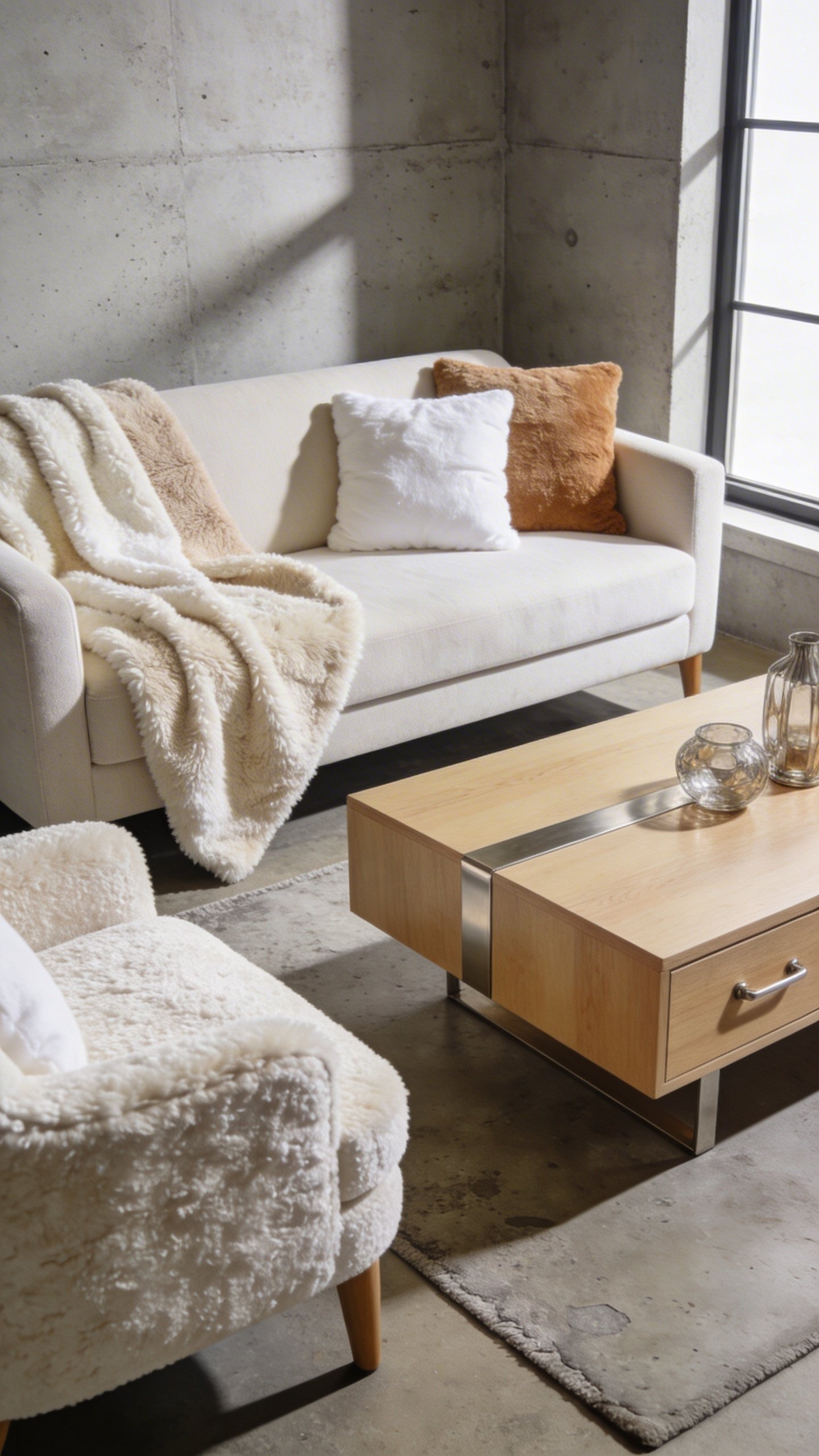
Think urban loft meets cozy cottage: a refined palette that reads contemporary without shouting. This palette centers around concrete tones softened by creams and warm whites.
It’s the kind of room that feels designed, but never stiff. Trust me, this is what magazine-worthy spaces feel like when they’re actually livable.
Color Palette
- Walls: whisper gray with warm undertones
- Major accents: creamy white, oatmeal, and soft stone
- Texture emphasis: micro-sherpa throws, brushed nickel, and blond wood
Key Pieces
- Panelled concrete-look feature wall or a soft concrete paint finish
- Low-profile sofa in ivory with charcoal piping
- Metallic-framed coffee table and a velvettextured accent chair
Styling Tips
- Keep lines clean and furniture legs slim to maintain airiness
- Introduce warmth with natural textiles and wood tones
- Use art with subtle color bursts to break the monochrome gently
This design speaks to city dwellers who want a calm sanctuary without sacrificing modern edge. It’s sophisticated enough for entertaining, down-to-earth enough for quiet Sundays.
3. Warm White with Natural Wood Cheer
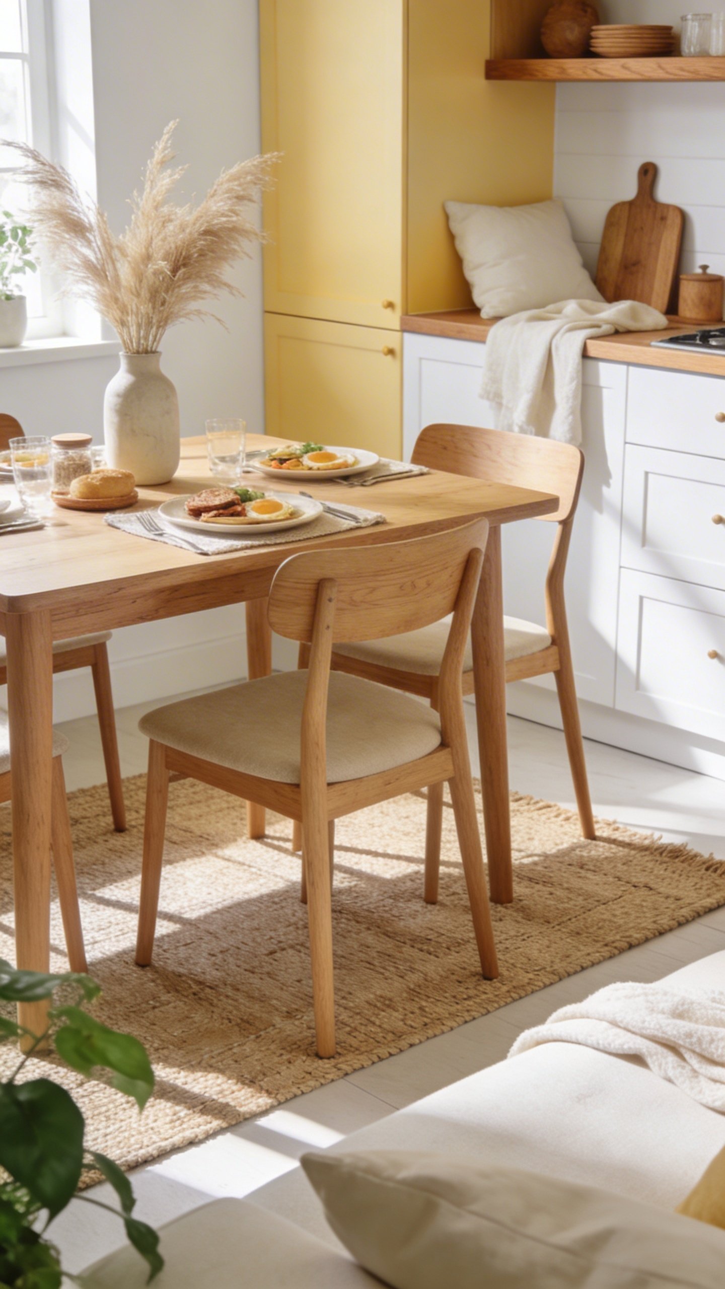
Bright, breathable, and forever friendly, this concept leans into white as the backbone and celebrates wood details as the soul.
It feels like a sunny morning in a Scandinavian-influenced home, with a wink of rustic charm. It’s the kind of space where you’ll want to cook, read, and host brunches in equal measure.
Color Palette
- Walls: crisp white with warmth (think vanilla or soft eggshell)
- Wood tones: lemony oak, light maple, and ash
- Textiles: cream, flax, and pale sand
Key Pieces
- Natural wood dining table with whitewashed finish
- White linen sofa with soft, durable slipcovers
- Woven jute or sisal rug for texture
Styling Tips
- Mix matte fabrics with a few glossy accents to keep it lively
- Incorporate handmade ceramics and woven baskets
- Layer sheer curtains to soften the light and add depth
This is the living space for people who value brightness, comfort, and durability. It’s friendly to kids and pets, yet stylish enough for dinner parties with friends who pretend they can cook.
4. Taupe and Velvet Comfort Zone
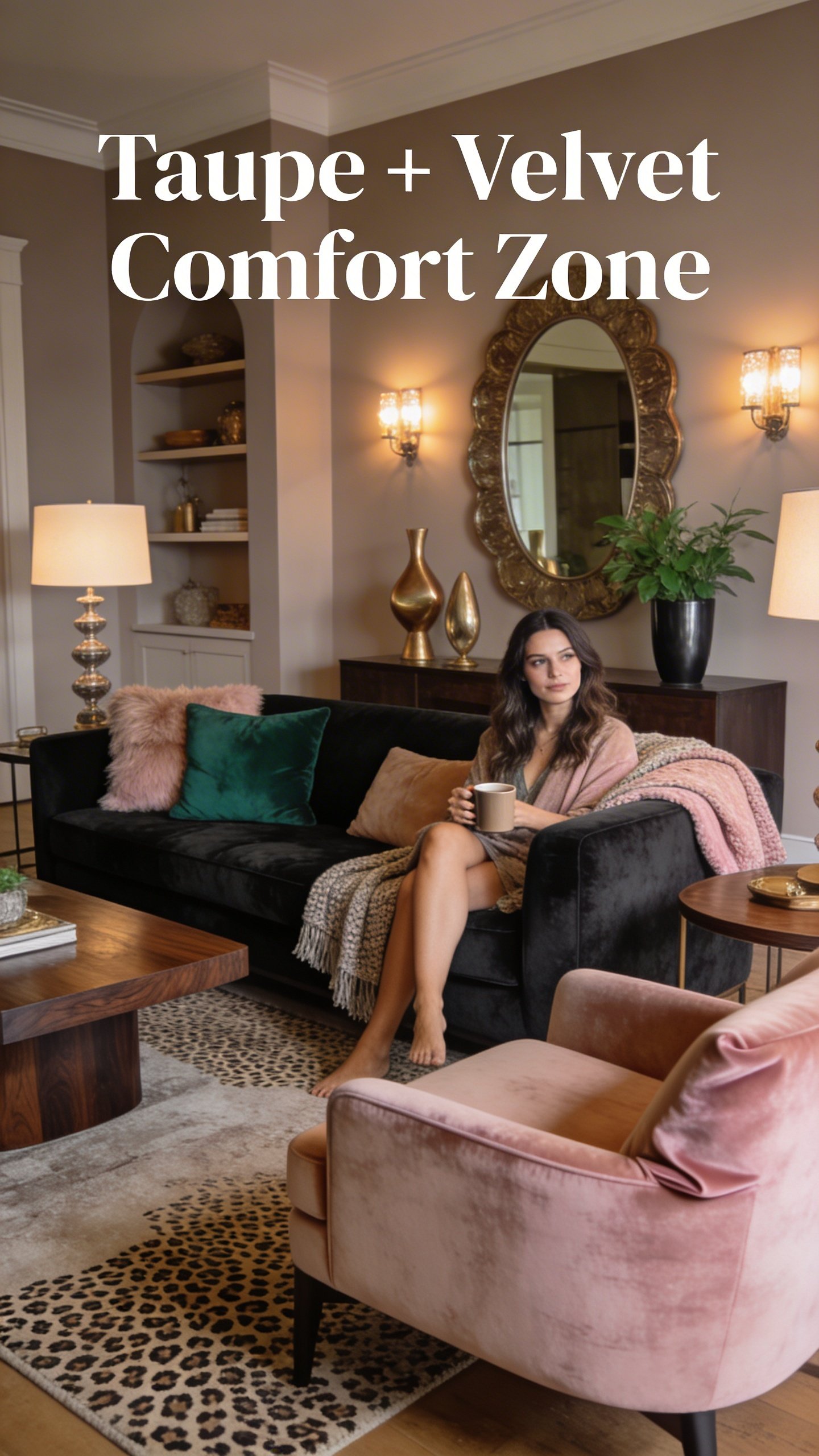
Take a deep breath: this is neutral with personality. Taupe walls act as a cozy canvas, while velvet textures add a lush, hotel-like feel without going overboard.
The room is all about tactile joy—plush seating, layered textiles, and a soft, moody glow. It feels luxurious but never stiff, like a weekend retreat you created in your own home.
Color Palette
- Walls: taupe with beige undertones
- Velvets: charcoal, emerald, or blush for accent moments
- Wood accents: dark walnut or espresso for depth
Key Pieces
- Deep, tufted velvet sofa in a neutral shade
- Mid-century wood coffee table with brass detailing
- Textured throw blankets and layered cushions
Styling Tips
- Balance heavy textiles with a few sleek metal pieces
- Use a dimmable lighting plan to shift the mood
- Add a statement piece of art to anchor the room
This concept is perfect for listeners who crave comfort without sacrificing style. It’s your best friend on chilly evenings and a wow moment for guests who think they’ve seen it all.
5. Beige-and-Black Modernist Lightness
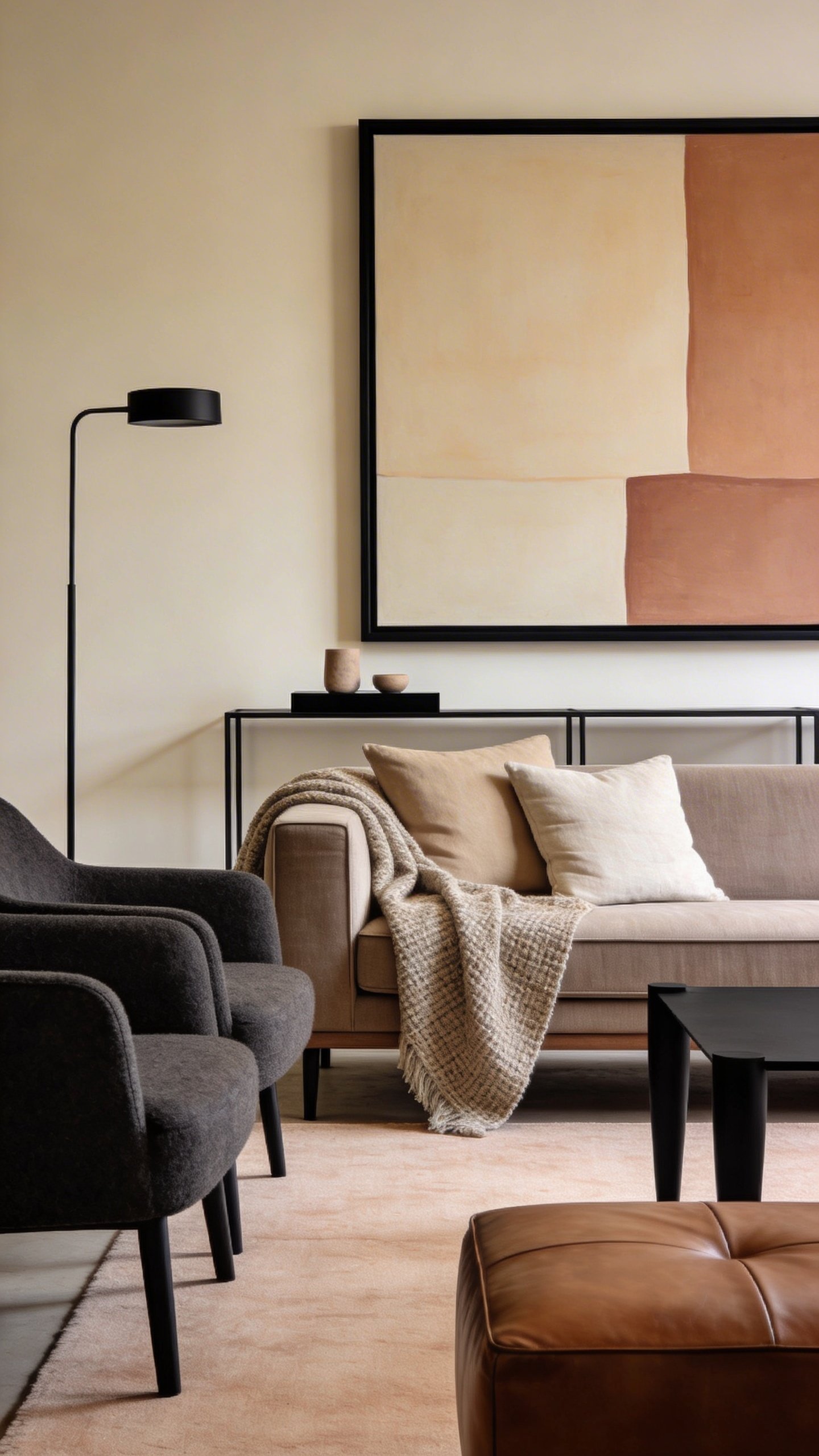
Bright neutrals with crisp black accents create a space that feels contemporary and incredibly polished. It’s minimal, yes, but far from sterile when you lean into texture and scale.
Think gallery-inspired calm: big art, clean lines, and a sense that every piece earns its place. IMO, this is the design you show off when you want to prove you can do modern without losing warmth.
Color Palette
- Walls: warm beige, pale clay
- Accent color: matte black details
- Textures: linen, wool, and a touch of leather
Key Pieces
- Low, modular sofa in a neutral beige
- Black metal-framed coffee table and light fixtures
- Simple, sculptural chair in a calm fabric
Styling Tips
- Let the art do the talking—big, bold pieces work best
- Keep clutter down to let the lines shine
- Add warmth with wood, plants, and soft textiles
This is for the design nerd who loves a clean, thoughtful space with a touch of drama. It’s modern, refined, and seriously livable—great for every room that doubles as a gallery and a hangout.
So, which vibe fits your home best? Each of these five designer neutral palettes is built to be adaptable, durable, and endlessly flattering. Seriously, you can mix and match elements from different looks to tailor a space that screams you—but still feels effortlessly cohesive.
Ready to try? Start with a single anchor piece—like a sofa or rug—in one of these neutrals, then layer in textures and small decors. Trust me, a well-chosen neutral palette can transform your whole space without a full remodel.