Painting tips for beginners: a friendly guide to start splashing color and not your living room rug
Starting with a splash of color can feel bold, but trust me, you don’t have to be a prodigy to enjoy painting. You just need a bit of curiosity, a willingness to mess up a few canvases, and the knowledge that the blank page isn’t judging you. So let’s dive in and keep it practical, not precious.
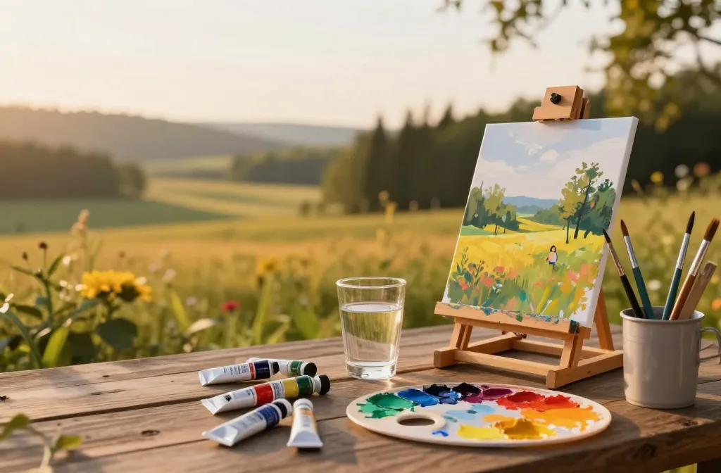
Choosing your tools without breaking the bank
Getting started doesn’t require a studio full of gear. You can begin with the basics and upgrade later as your curiosity grows.
– Pick a medium you actually want to use. Acrylics are forgiving and quick-drying, whereas oils reward patience and layering. Watercolors sing when you want light, airy effects, but they’re a bit more tricky.
– Brushes matter more than you think. A few sizes (small for detail, medium for general work, and wide for washes) will cover most needs. Look for synthetic bristles if you’re on a budget; they’re sturdy and easy to clean.
– A sturdy, inexpensive palette is your friend. A plastic palette with sections makes color mixing easier. Don’t underestimate a good cup for water or solvent—clean tools are happier tools.
– Surface setup does matter. Start with a cheap canvas or sturdy paper designed for your medium. A better surface won’t fix bad technique, but it will make practice feel nicer.
– Don’t overthink the storage. Keep paints in a cool, dry place and brushes laid out so they don’t dry in bizarre shapes.
Mastering the basics fast: color, shape, and value

If you can nail color, shape, and value, you’ve got a solid backbone for most paintings. Everything else is polish.
Color in a nutshell
– Start with a limited palette. Mix primary colors to create a wider range instead of buying every hue. It saves money and brainspace.
– Learn about warm vs. cool. Warm colors advance; cool colors recede. Use them to push or pull elements in your composition.
– Don’t fear black and white. They aren’t the enemy; they’re your friends for creating depth and mood. Use them sparingly to avoid muddying your tones.
Value scales are your secret weapon
– Value means how light or dark something is, independent of color. A great painting can exist in grayscale.
– Practice stacking values. Paint a grayscale swatch to compare your darks, mids, and lights. If your highlights disappear into the background, you’ve got a value problem, not a color problem.
– Contrast saves a painting. A strong light source will pull your subject forward and give life to a flat surface.
Getting comfortable with brushes and strokes
Technique isn’t about virtuosity on day one—it’s about building muscle memory. Here’s how to get there without drama.
– Use the whole arm, not just the wrist. This yields broader, cleaner strokes and less wobble.
– Load your brush right. Dip, tap off excess, then apply. Too much paint makes beginners’ problems obvious—especially on canvas.
– Practice common marks. Horizontal, vertical, diagonal, and circular strokes become a second language with repetition.
– Cleanliness matters. Rinse brushes between colors, wipe the ferrule, and shape bristles back to a point. A tidy brush is a happy brush.
Texture and layering basics
– Build up gradually. Start with large shapes, then refine. Think of it as sculpting with color.
– Glazing can be your friend. A thin layer of transparent color over a dry underpainting adds depth without muddying.
– Dry brushing for texture. Use a mostly dry brush with a light touch to suggest rough surfaces or highlights.
Composition without guilt trips
Composition is where your painting starts to feel intentional rather than accidental doodling.
– Keep your focal point obvious. Ask yourself, what should the viewer notice first? Use contrast, color, or placement to guide the eye.
– Rule of thirds is a nice starter guideline, not a prison sentence. Place key elements along imaginary lines but feel free to break the rules when it serves the image.
– Simplify. If a piece looks chaotic, trim it down. Fewer elements with clear relationships often read better.
– Leave some air. Negative space around the subject can be just as important as the painted area.
Planning your piece quickly
– Do a quick thumbnail sketch. It doesn’t have to be fancy—just a few shapes to test composition.
– Do a value study first. Grayscale rendering helps you see the light and shadow relationships without color getting in the way.
– Visualize the palette. Pick a main color and a couple of supporting tones to keep things cohesive.
Practical tips to stay motivated and avoid burnout
Painting should be enjoyable, not a source of stress. Here’s how to keep it fun.
– Set a small, achievable goal. A 20-minute study, a quick color swatch, or a mini still life helps you progress without feeling overwhelmed.
– Embrace happy accidents. Some of the best discoveries come from unexpected results. FYI, that blob of paint might be your new favorite texture.
– Schedule regular practice, not perfection. Consistency beats intensity. Even a short session every other day adds up.
– Document your progress. Take photos of your work in progress and at the end. You’ll notice growth you can’t see in the moment.
Dealing with frustration
– Step away briefly. A quick walk or shower can reset your eyes and mood.
– Switch tasks. If you’re stuck on color, switch to value studies or a different subject.
– Celebrate small wins. A clean edge, a clean blend, or a smoother transition deserves a nod.
Learning from real paintings: references, studies, and practice
Studying what others did helps you understand decisions behind the brush, not copy-paste the work.
– Use references wisely. Photos are helpful, but avoid tracing unless you’re deliberately practicing that skill.
– Do speed studies. Try finishing a small piece in 30-60 minutes. It trains you to make decisive choices.
– Copy with purpose. Recreating a favorite painting helps you dissect technique, color choices, and composition. Do it as an exercise, not as a final work.
– Practice from life. Still lifes, plants, or simple scenes outdoors expose you to genuine light and color relationships.
Finding a friendly critique
– Seek constructive feedback. Ask specific questions like “Is the focal point clear?” or “Do the values read correctly?”
– Join a community. Online groups, local art clubs, or workshops provide practice partners and accountability.
– Filter criticism. Not every comment applies to your goals. Keep what serves your growth and ignore the rest.
Common beginner pitfalls and how to dodge them
We all stumble. Here’s how to recognize and pivot quickly.
– Overloading the brush. Your piece will become muddy. Learn to wipe off excess paint and use thinner layers.
– Perfecting too early. Start rough and refine later. Patience pays off more than micromanaging early on.
– Ignoring lighting. Neglecting light direction makes flat, lifeless work. Decide on a light source early and keep it consistent.
– Skipping drying time. A wet top layer can smudge underneath. Let layers dry or work in sections.
FAQ
Do I need fancy supplies to start painting?
Not at all. Start with a basic set: one starter acrylic or watercolor palette, a few brushes, paper or canvas, and a cup of water. You’ll learn what you actually want to invest in as you go. FYI, quality matters more for longevity than for starting out, but you don’t need professional-grade gear to begin.
How do I choose a subject when I have no confidence?
Pick something simple and relatable, like a fruit bowl, a mug, or a single flower. The goal is to practice shapes and values, not to produce a masterpiece on day one. If you’re bored, switch to a favorite movie still or a quick landscape study—anything that sparks curiosity.
What should I do if my colors look muddy?
Often muddy color comes from layering too many transparent layers, not cleaning brushes between hues, or using too much black. Start fresh with clean brushes, pre-mix your colors on a palette, and keep darks and lights distinct. A quick value check can save a lot of headaches.
How long should a beginner painting take?
Depends on the piece. A simple study might take 20-40 minutes; a more complex scene could take an hour or two spread over multiple sessions. The key is consistent practice, not marathon sessions every time.
Is it okay to imitate other artists as a learning exercise?
Yes, as a learning method: study technique, color choices, and composition by copying for practice. Then gradually move toward creating your own original work. It’s a stepping stone, not a final destination.
Conclusion
If you’ve stuck with me this far, you’re already halfway to painting liberation: you have a plan, a handful of tricks, and the guts to pick up a brush. Start with the basics, play a lot, and don’t fear the messy parts. Progress isn’t a straight line; it’s a wavy, satisfying arc of color and texture.
So grab a cheap canvas, press play on your favorite playlist, and tell yourself you’re allowed to fail—and learn. If you’re wondering where to go next, try a small color study this weekend. Then post your results somewhere friendly and let the conversation begin. You’ve got this.