These kitchen ideas prove you don’t need a full remodel to look polished. Each design packs a wow factor without the drama. Ready to elevate your space without breaking the bank?
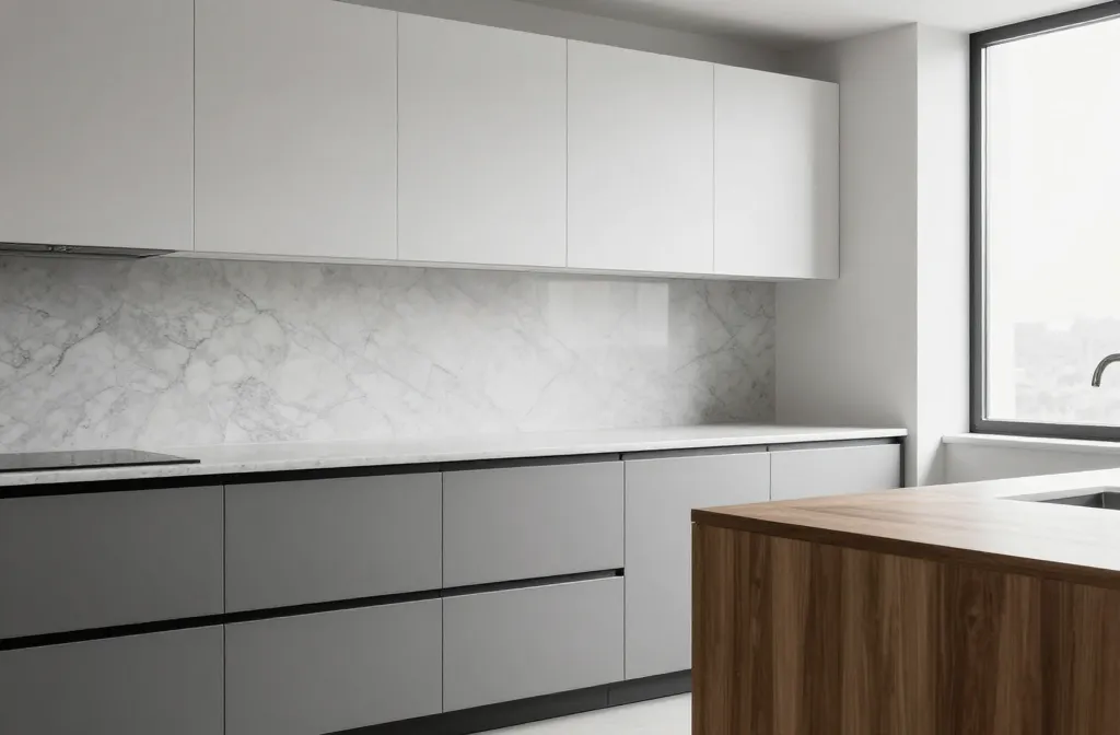
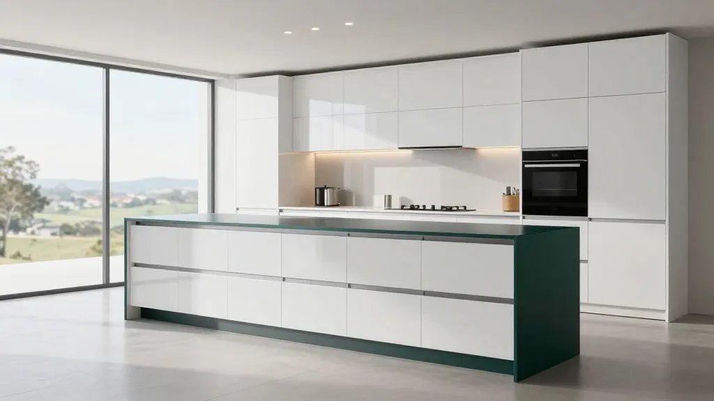
1. Minimalist Monochrome Magic
Clean lines and a single color family create a cafe‑worthy look. Monochrome kitchens feel calm, organized, and totally chic.
Why it works: less visual noise equals more focus on quality details. FYI, the right materials matter here.
Key Elements:
- Matte black hardware
- Flat-panel cabinets in white or gray
- Quartz countertops with subtle veining
Pro tip: keep appliances in a cohesive finish to maintain the seamless vibe. Trust me, the payoff is sophisticated serenity.
2. Two-Tone Dream Kitchen
Two-tone cabinets play with contrast without shouting. A lighter upper and a deeper lower shade adds depth and personality.
Why it works: breaks up sea of cabinets and highlights architectural lines. IMO, this is the easiest way to add character.
Tips:
- Choose complementary colors from the same family
- Balance with a neutral backsplash
- Use different finishes for upper and lower cabinets
End note: this look photographs beautifully and hides minor wear over time.
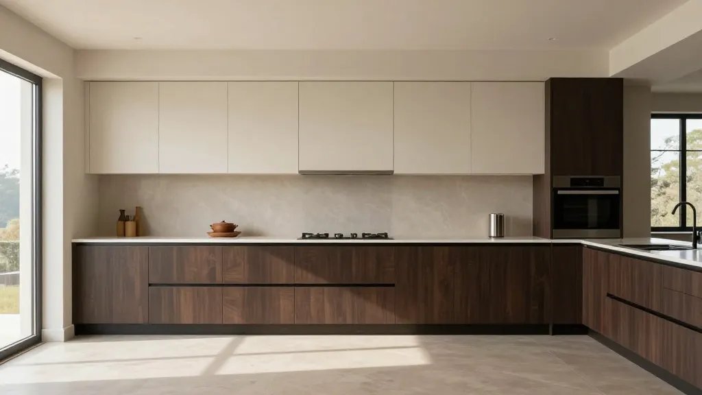
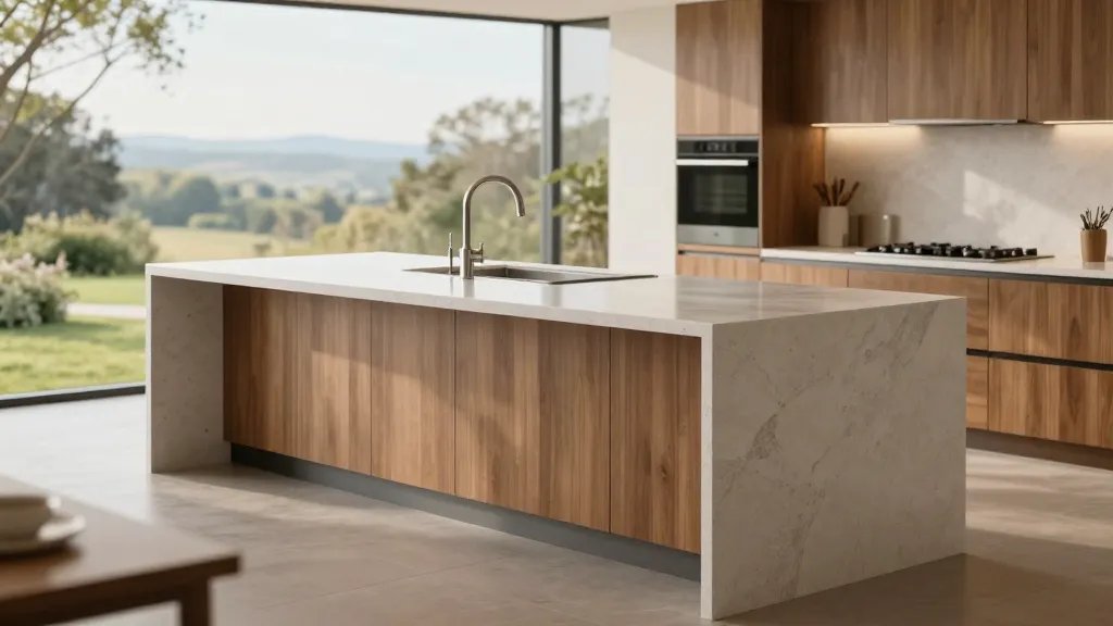
3. Warm Wood and Cream Contrast
Natural wood tones add warmth, while cream keeps it soft and timeless. This pairing feels inviting and upscale.
Why it shines: textures reign here, not loud patterns. FYI, keep wood sealed for longevity.
Materials:
- Oak or walnut cabinetry
- Cream quartz or marble-look countertops
- Brushed brass or matte black hardware
Bottom line: it’s the cozy-cafè vibe you can live with every day.
4. Sleek Handle‑Less Luxe
Handle‑less cabinets scream modern sophistication. The absence of hardware makes the space feel bigger and cleaner.
Why it works: smooth surfaces reflect light and look expensive. Seriously, it’s a small detail with a big impact.
What to consider:
- Push-to-open or integrated channels
- High-gloss or satin finishes to avoid fingerprints
- Strategic lighting to highlight the lines
Bonus: this style pairs well with bold countertops.
5. Classic White with Black Accents
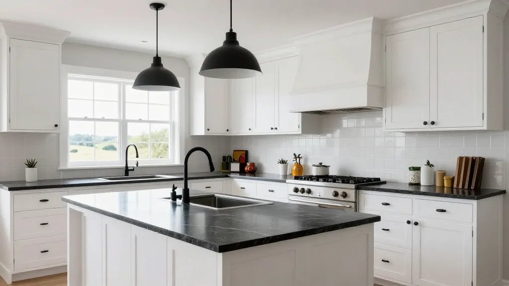
A timeless combo that never goes out of style. White cabinets keep things bright; black accents add drama and edge.
Why it works: light reflects, spaces feel larger, and the contrast guides the eye.
Key Elements:
- Pendant lighting with black shades
- Black faucet and hardware
- Dark veined countertops for depth
Use this when you want a polished, versatile backdrop for colorful accessories.
6. Open Shelving for a Studio‑Cafe Look
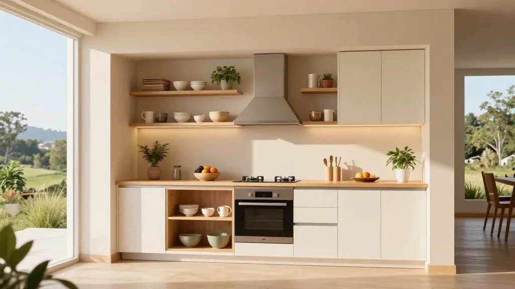
Airy, accessible, and Instagrammable. Open shelves cue a casual, lived-in vibe while showing off your favorite pieces.
Why it works: it reduces cabinet bulk and invites you to curate daily favorites.
Suggestions:
- Pair with closed storage elsewhere for balance
- Include a mix of bowls, plants, and cookbooks
- Use under-shelf lighting to highlight decor
Benefit: less cluttered countertops and a styled, functional display.
7. Industrial Edge with Concrete Countertops
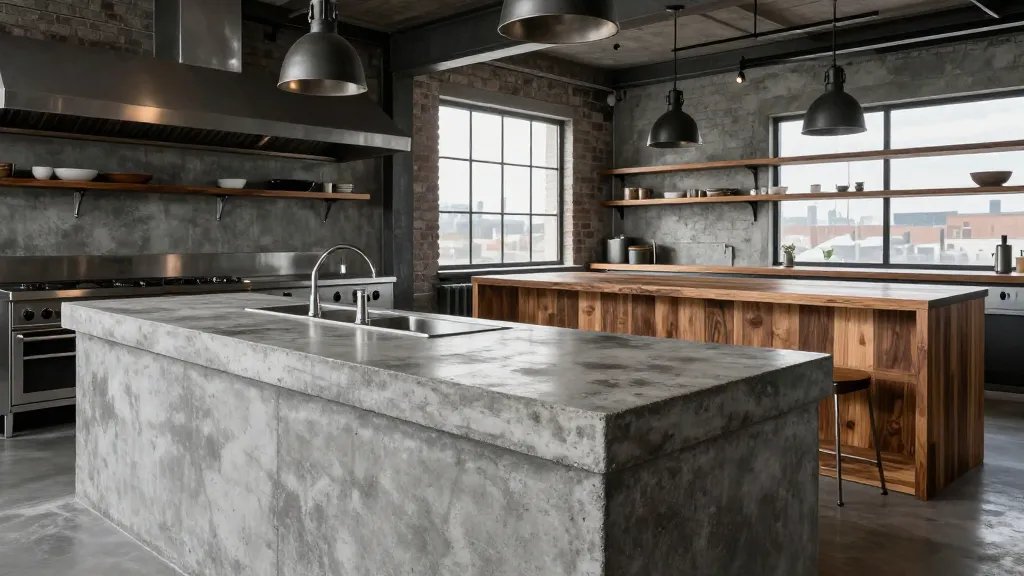
Concrete countertops bring an architectural punch and durability. Combine with metal accents for an urban loft vibe.
Why it shines: rugged texture looks designed, not default. Trust me, it ages beautifully with patina.
Tips:
- Matte finishes hide wear
- Include warm wood touches to soften the look
- Seal properly to prevent staining
Best for: modern spaces craving a bold, durable focal point.
8. Painted Cabinets in Bold Colors
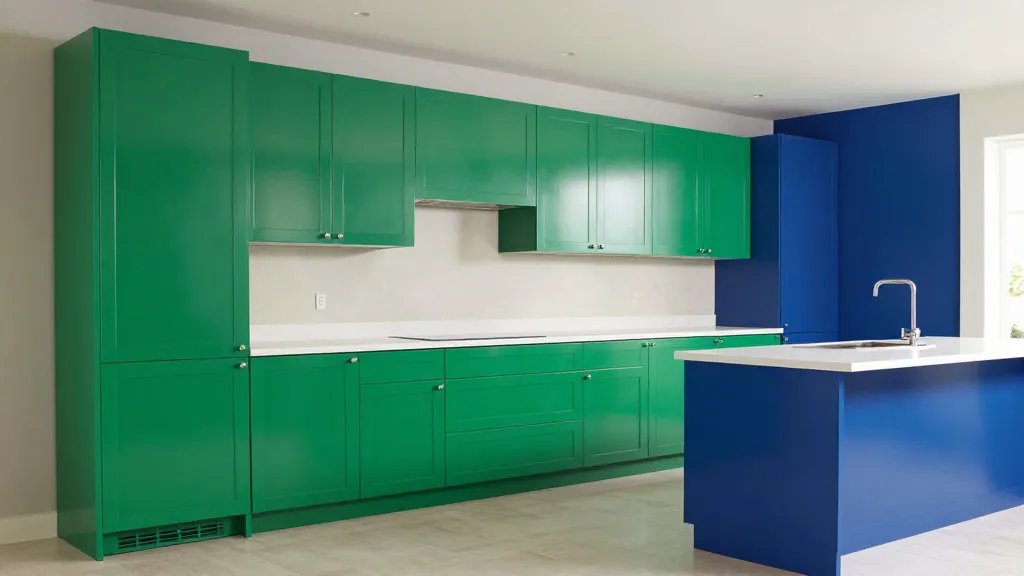
Color can totally transform a kitchen. A bold hue on cabinets acts as art in a functional space.
Why it works: it personalizes the room and makes cabinetry the star feature.
Suggestions:
- Pair with white or light countertops to balance intensity
- Neutral backsplash keeps the look cohesive
- Use color in an accent wall or island for payoff
Bonus: a high-gloss finish can amplify the color drama.
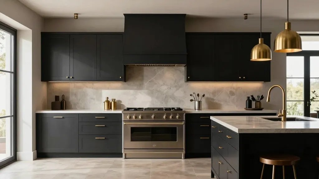
9. Black Kitchen That Feels Luxe
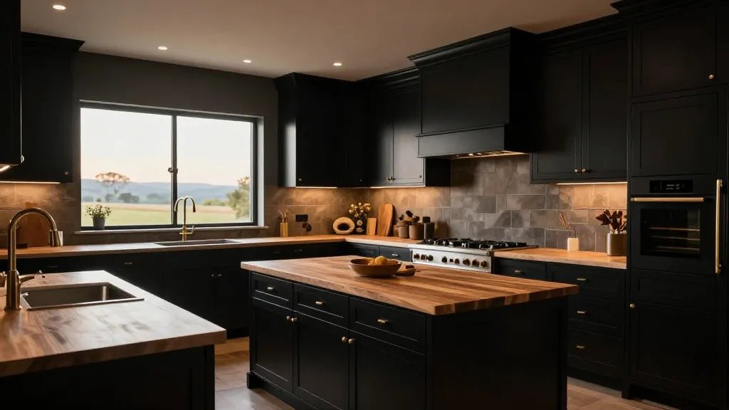
Yes, black kitchens can be warm and inviting, not cave-like. Add warmth with wood, brass, and warm lighting.
Why it works: black absorbs glare and hides fingerprints, giving a crisp, high-end feel.
Elements to include:
- Warm wood countertops or butcher block
- Gold or brass hardware for warmth
- Soft, warm LED lighting under cabinets
When to use: if you want drama with everyday practicality.
10. Coastal Breeze: Light Blues and Whites
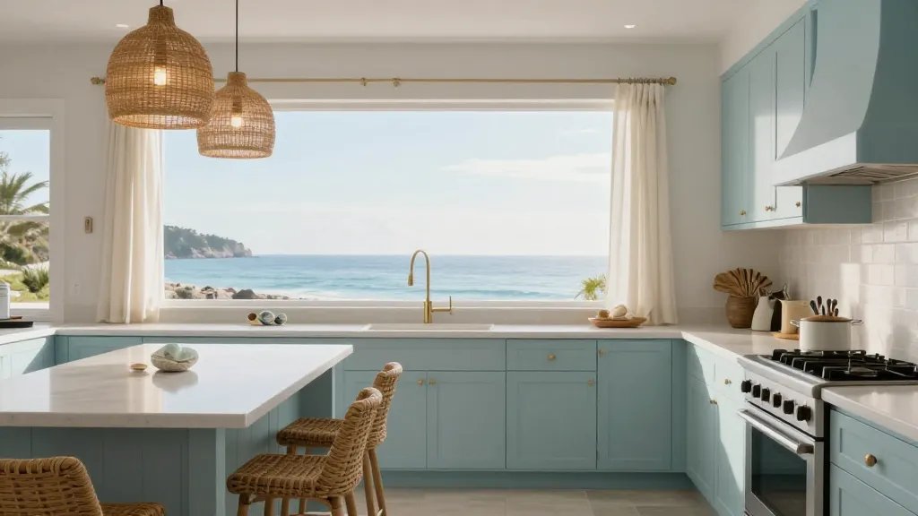
Light blues, whites, and airy textures evoke sea air and calm mornings. It feels fresh and wonderfully beachy.
Why it works: soft color palette makes small kitchens feel spacious.
Materials:
- Shaker cabinets in seafoam or ice blue
- White quartz countertops
- Wicker or rattan bar stools for texture
Tip: add a sea-glass centerpiece or shell accents to finish the vibe.
11. Scandinavian Simplicity with Warm Accents
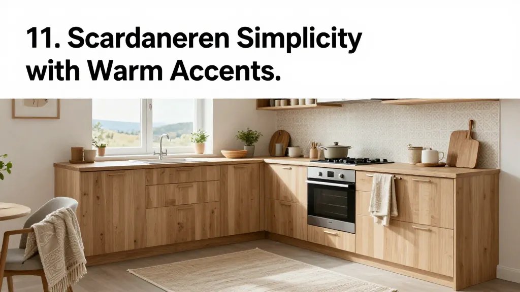
Think: bright, airy, functional. Scandinavian design leans on light woods, clean lines, and cozy textiles.
Why it works: it’s approachable and calm—perfect for busy homes.
Key Points:
- Light oak cabinetry
- Neutral backsplash with subtle pattern
- Soft textiles like wool rugs and linen towels
End idea: layer textures for depth without visual clutter.
12. Marble‑Inspired Countertops for Instant Luxury
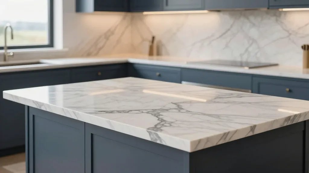
Marble surfaces bring luxury in a snap. Even faux marble with good veining looks refined and timeless.
Why it works: classic patterns elevate any cabinet style and tie colors together.
Tips:
- Pair with solid color cabinets to let the pattern pop
- Seal marble to prevent staining
- Match veining with cabinet hardware for cohesion
Apply when you want a refined, high-end focal point you can wipe down after cooking.
13. Practical Kitchen Island Oasis
A well‑placed island adds prep space, casual seating, and a visual anchor. It’s the heart of many homes.
Why it works: it creates zones and conversation flow without reconstructing the room.
Ideas:
- Counter seating with a contrasting bar height
- Integrated sink or cooktop for efficiency
- Under‑counter storage to keep counters clear
Bottom line: an island makes your kitchen feel custom without the custom price tag.
14. Glass Backsplash Gleam
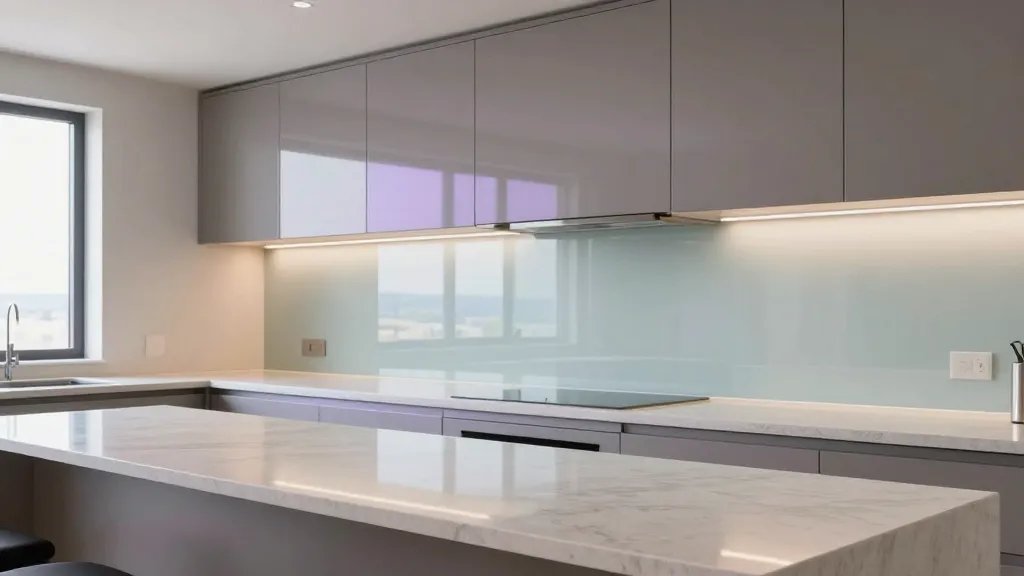
A glass backsplash bounces light and adds a dash of sophistication. It’s easy to wipe and endlessly versatile.
Why it works: reflects color from cabinets and accent lighting, instantly brightening the room.
Materials:
- Frosted or clear tempered glass
- Neutral grout to minimize lines
- Seamless panels for a luxe look
Tip: pair with understated countertops to keep the focus on shine and light.
15. Textured Tile that Tells a Story
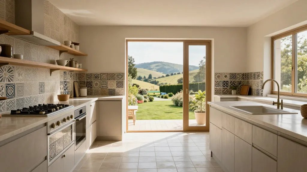
Texture on the floors or backsplash adds depth and personality. Don’t be afraid to mix patterns with restraint.
Why it works: small textures create big visual interest without overwhelming the eye.
Suggestions:
- Mix a bold tile with a subtle neutral tile
- Use texture on a feature wall or behind open shelves
- Coordinate grout color to blend or pop as desired
Use when you want a space that feels crafted rather than cookie‑cutter.
16. Hidden Appliances for a Seamless Look
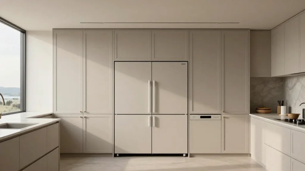
Panel‑ready fridges and integrated dishwashers disappear into cabinetry, giving a streamlined, magazine-worthy kitchen.
Why it works: functionality stays, but the room reads as cohesive and calm.
What to plan:
- Cabinet panels matched to surrounding cabinetry
- Consistent hardware rhythm across appliances
- Ventilation that blends with the ceiling line
End note: your kitchen will feel larger and more intentional.
17. National Park-Inspired Natural Light and Plants
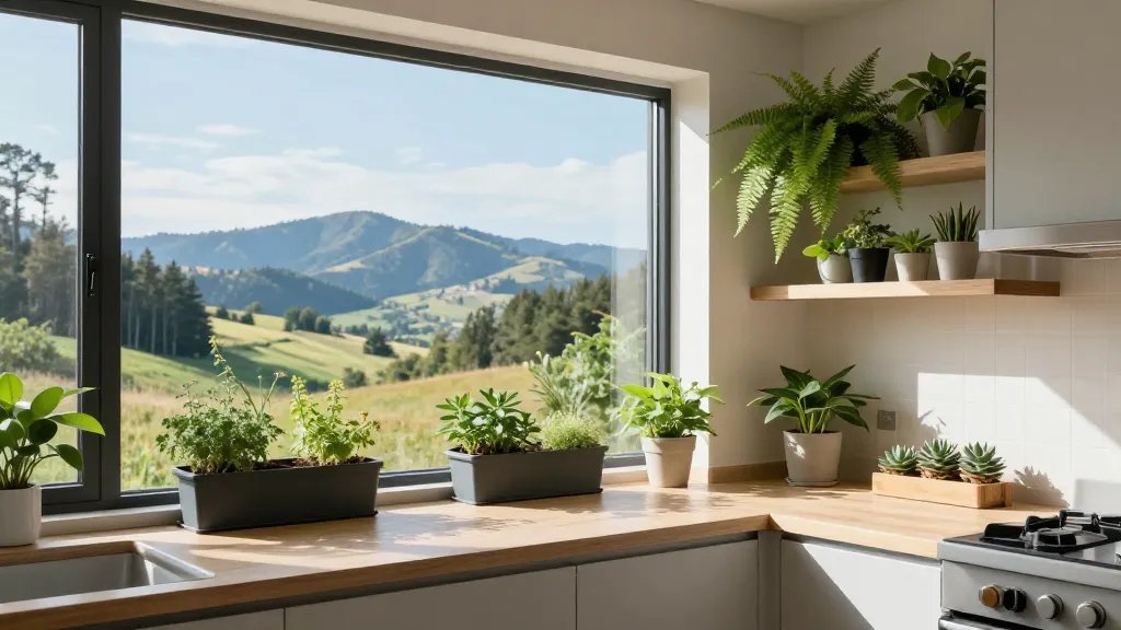
Plants bring life, color, and a touch of nature indoors. A few well-placed greens can transform your kitchen’s mood.
Why it works: nature softens hard surfaces and adds movement.
Plant Picks:
- Herb planter by the window
- Potted ferns or pothos on shelves
- Low‑maintenance succulents for countertops
Tip: use a bright, sunlit corner to keep greens thriving and your space fresh.
18. Mixed Metals for Subtle Drama
Don’t pick one metal—combine brass, matte black, and stainless steel for a layered, spirited look.
Why it works: layered metals create visual interest without clashing. Seriously, it looks boutique-level when done right.
How to mix well:
- Keep a dominant metal (e.g., matte black) and add two accents
- Spread metals across hardware, lighting, and faucet
- Balance with neutral surfaces to prevent busy overload
End note: this approach keeps your kitchen feeling intentional and modern.
Conclusion: you’ve got a full menu of professionally styled vibes to choose from. Pick a few you love, mix in your favorites, and start small if you want—maybe a bold island or a new backsplash. You’ll be amazed at how these ideas transform everyday cooking into a design moment.